// Nodus – Design Decisions

Fusion User and Indie Dev Simflare wrote a outstanding post mortem on his game Nodus and his experience publishing it. Article originally posted at Stuart’s Pixel Games blog (https://stuartspixelgames.
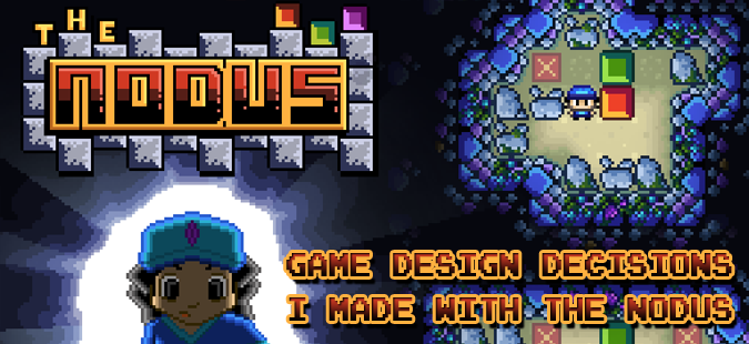
I recently released my sliding puzzle game, The Nodus, for Android and iOS. This article reveals the game design lessons I learned, decisions I made and why through the design process. Many of these are small lessons, but together they make The Nodus work.
Fade-ins and Fade-outs
I wanted every screen to have a soft fade in and fade out. Some games over do this, but a quick, appropriately placed fade can soften transitions. Even a half / quarter second fade softens things.
Not only do I fade the entire screen in and out, but the GUI buttons for the game (eg. D-pad, Undo, etc) fade in separately at the start of the level. I think it adds a nice level of polish and improves the mood.
Atmosphere
I think it’s good to know early on what kind of atmosphere your game will have. I wanted something soft, relaxing and ethereal, and all of my design decisions were based around that. Music was a big part of mood setting, as well as lighting choices in the graphics and the soft fade-ins and fade-outs.
Level Endings
When you finish a level, you automatically go straight to the next level. Going back to the main menu disrupted the experience I had created. Jumping straight to the next level keeps the player engaged and increases the chance they will keep playing. Taking them out to the menu felt like someone talking during a film.
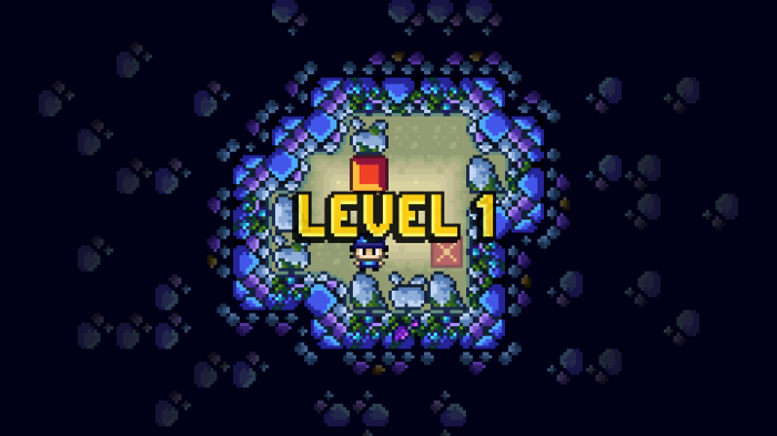
Level Beginnings
Player’s appreciated being told what level they were up to at the start of the level, especially since each level goes straight to the next. Fading the text softly in and out also adds to the mood.
Pause Screen – Level Numbers
I decided it was useful to put the current level number in the pause menu. Otherwise you had to quit the level to know where you were up to if you had forgotten.

No Sound Effects
I chose to have no sound effects. All of the ones I tried jarred with the music and destroyed the subtle atmosphere I was trying to create.
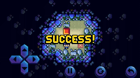
Exploding Stars
A few times I use exploding star effects to enhance various text I was displaying. Most notably I used this on the “Success!” words that appear when you finish a level. It gave that little bit extra buzz for finishing a level.

Snappy Movement
I used snappy movement for this game: the character immediately goes from one grid square to the next without transition. Sliding the player to the next position, like in the old Pokemon games, slowed down the gameplay and detracted from the experience. By having quick movements, players could test their potential solutions to the puzzles faster and the game could keep up with their brain, because the brain is constantly rushing ahead to the next move to solve the puzzle. It was frustrating waiting for the character to finish walking so you could finish trying your solution.
There is some animation, but it’s snappy and brief like the movement; otherwise it looked stuttery and weird. The character animates one step for every one grid square he moves.
GUI – Placement of Buttons
Some people had to curl their thumbs too much to use the D-Pad because it was too close to the edge of the screen, so I moved it further away from the edge. It is not visually where you would expect, but it’s at the most comfortable position for most people.
I also deliberately spread out the Undo and Restart buttons to prevent people from accidentally pressing the wrong button, which did happen when they were closer together.
GUI – Design
I chose to make the GUI buttons glossy and polished and higher res (not pixel art) so that they stood out from the rest of the game. The glossy polish makes them look more 3D and adds a nice touch.
GUI – D-Pad Button Mask
I noticed people would often go to press the D-Pad, but slightly miss the button. They would then be confused why the hero didn’t move. In their mind their finger was in the right spot. I decided to create very large button masks behind the D-Pad, so it would be almost impossible for them to miss it. By using a cross shape, the D-Pad responds as their mind would expect. No one ever has to think about the controls anymore.
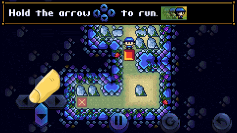
GUI – Holding Down The Button
You can hold down the D-Pad and Undo buttons to have the player move in a constant line without having to tap. In the initial version, however, people were accidentally moving two spaces when they only wanted to move one. I fixed this by adding a brief delay, so that the character would move, pause, and if the button was still being held down after a certain time period, they would then start moving again until the button was released. I tried finding the smallest amount of delay possible that would not interrupt game flow, but wouldn’t cause people to accidentally move two spaces.
Tutorial – The Magic Finger
I use a big magic finger to show people which buttons to press in the tutorial. This is useful because over 90% of people would not read the text. Expect people not to read text in your tutorials – teaching through doing is better. The finger is also constantly animated, slowly hovering up and down on the spot. This is to draw the players attention.

Tutorial – Sliding Magic Finger
The magic finger slides to the next button you need to press, rather than instantly appearing there. This is necessary to hold the user’s attention and guide them to where they need to go. Otherwise they will easily not see it and just continue on their merry way.
Tutorial – Greyed Out Buttons
 I also greyed out the buttons that shouldn’t be pressed during the tutorial. This directed the player (along with the magic finger) to what they should be doing and where they should be looking. Player’s aren’t good at following directions and just want to go wherever you don’t want them to, so I found it important to give them as many visual cue’s as possible to help guide them. I had tried fading out the buttons until they were barely visible, but players became confused if they couldn’t clearly see the buttons.
I also allow the greyed out buttons to behave as normal, because when they were visible but unusable, this confused some players. And if someone is clever enough to finish the tutorial without doing it the way I intended, that’s their choice.
Tutorial – Was It Necessary?
I would have preferred to have no tutorial. In the original test versions of the game I had no tutorial and instead taught the concepts of the game through level design, and The Nodus does do that with many of the concepts. But there are many people who are not familiar with playing these sorts of games and would not have understood what the Undo and Restart buttons were, or why some blocks don’t need to be pushed on the square, so to make the game approachable to the widest possible audience, I put in a very brief tutorial to teach the game’s core concept’s. I think it was the right choice. I did, however, keep it to an absolute minimum and use as little text as possible.
Minimal Text
The game uses almost no text. People hate reading and I know most people can enjoy my game, regardless of what language they can speak, so it minimizes the need for translation.

Story Without Text
The story has no text. The title screen actually is the “intro cut scene” because it shows the character entering the cave. The ending story shows the hero finding treasure – just one picture. I like the idea of communicating as much story as possible without words, like the old black and white films. Again, it’s very cross cultural and means there’s no problem with language barriers.

Graphics
I learned a few tricks with getting the graphics working. In a birds-eye view, it can be particularly hard getting a good contrast between your characters and environments while maintaining a pleasant colour scheme. It’s all about contrast. You need your game objects to stand out from the background. This is easier in side-scrollers when you have a pale blue sky in the background, but harder in a top-down game. One trick to see if your colour scheme is working is to turn the colour off (reduce saturation) so that it’s black and white and look at the differences in light and dark tones. This doesn’t always work though. Another trick is to turn the saturation all the way up and see what stands out.

You can see above that the black and white trick didn’t work in my picture, because the colours were too tonally similar. But turning the saturation up made it clear where the contrasts were.

Above shows early concept art compared to the final game art. As you can see the hero stands out quite well from the ground in the final art, but in the early concept art, the hero is very hard to see – he’s almost the same colour as the ground.
I fixed this by turning the non-interactive objects, the ground and the crosses on the ground, a very pale and unsaturated colour, and made the player and obstacles strong, saturated colours. I also made sure anything that was purely background but could not be interacted with had no outline. Notice how the crosses have outlines up top but not in the final art – this is because you can walk over them. They are not solid obstacles, and this makes it visually clearer they are background. In the early concept art people thought the grass and the crosses were a solid object that couldn’t be walked across – now it’s clear you can walk over the grass and cross.
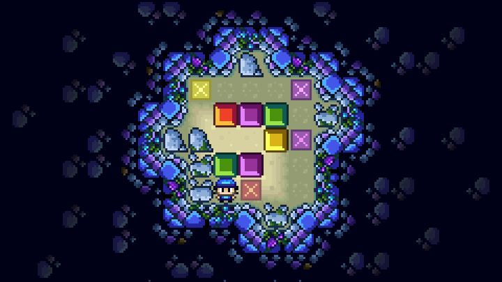
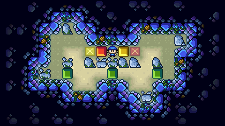
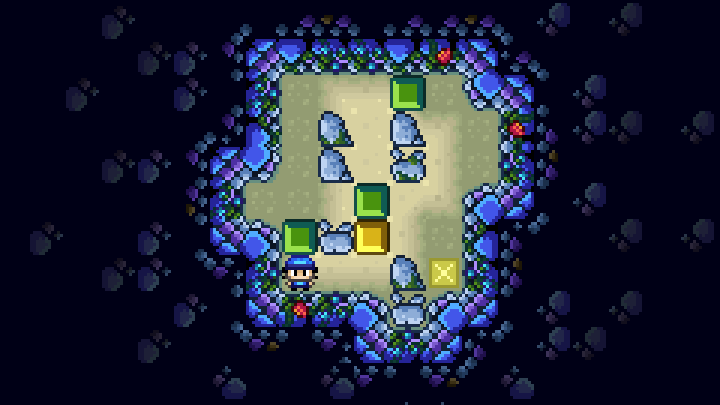
Simplifying the Puzzles
Right at the core of this game was the question, “What makes a good puzzle?” In the end I boiled it down to a few principles I think apply to a game like this:
- There should be an obvious problem
- Your brain should have some idea of how to begin attempting to solve the puzzle, even if you’re first guesses are wrong (they hopefully are wrong)
- A good puzzle shouldn’t be too easy (except for the first few levels)
- The first few puzzles should be easy enough to give the player a feeling of satisfaction and a chance to learn the rules before challenging them harder
- The solution to a puzzle should not be ambiguous
- There should not be too many idea’s within an individual puzzle – it is best if there is one core idea
- The best puzzles look simple yet are difficult
- Puzzles that have lots of “idea’s” as an attempt to make them difficult, rather than one simple but challenging idea, could be better designed
- In other words, complicated puzzles are not necessarily good puzzles – simple but challenging puzzles are better
I have generally tried to stick to the above principles and have one core idea in all of the puzzles in The Nodus.

Of course levels should gradually scale in difficulty as the game progresses. However, I tried to design the puzzles in such a way that they taught the player how to solve later puzzles by gradually introducing new ideas. I was able to do this after working out what many of the core mechanics of a game such as this are, then introducing them gradually, such as, once a box is on a wall or in a corner, you can’t get it off. I later introduced different coloured blocks, but the way I designed the levels showed people what to do with these new coloured blocks so that I didn’t need a new tutorial to explain it.
Conclusion
If every small decision is done well, the whole game will be done well. I try and put the most effort into every tiny detail to make it the best experience possible.
I hope you found this article interesting and helpful to your own projects. If you haven’t already played The Nodus, try it out and I hope you enjoy it. You can play it now on either Android or iOS.
Find other articles (https://stuartspixelgames.
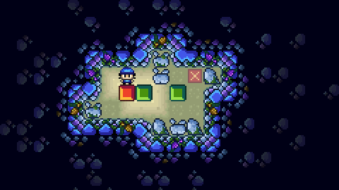
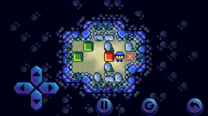
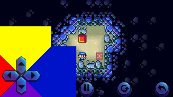
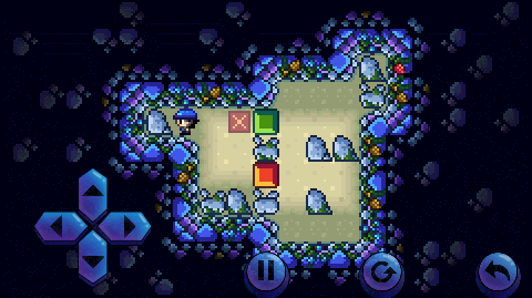
Screenshots from the author's games

About
Article by Simflare
Date: 05/16/2016
Game pages